v0.2 (beta)
Color Selection Tool
This tool can help guide you in choosing the best main color for your palette. The main palette color informs all other color options. It should be the color of your brand or the color people will associate with your app, and it should also be reflective of the emotion of your app or brand.
Base hue: Blue
Blue can represent trust, confidence, calmness, stability, and loyalty.
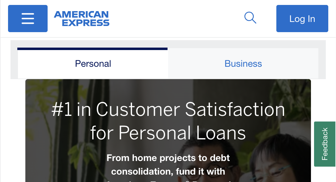
Example brands: Facebook, IBM, American Express, Chase, Tiffany & Co., Ford, Intel, General Electric.
Warning: this color may be too bright, dark, or de-saturated and may not work perfectly with other colors.
Example UIs where blue is the dominant color: